Monday, December 7, 2009

Demo: How to Digitally Retouch Photographs Using Photoshop

I have been working for a professional photography studio since I was a junior in high school, and among many of my various jobs and tasks, one that I have had to learn that has actually been extremely beneficial is digitally retouching photographs. What people may not really notice is that there are so many little things you can do to a photograph to make it look a million times better! And whether you are just posting pictures on flickr, facebook, what have you or printing up a nice photograph to frame or send to some family, you want to be able to look your best!

Here is a few tips on how to make some fairly basic, but effective changes in Photoshop:

1. RED EYE

This is one of the most commmon problems with pictures. There are two ways to fix that. There is the quick and painless way, however you need the latest version of Photoshop (CS4) in order to use it. What you do is go to your toolbar on the right side of the screen and find the spot healing brush. If you click on that button and hold it down, other menu options under that tool will appear, one being called the "Red Eye" tool. Once you select that tool, all you need to do is click onto the area with red eye and done! If you are unhappy with the way it looks, you can undo your work (ctrl+Z) and adjust the settings at the top toolbar to meet your needs.

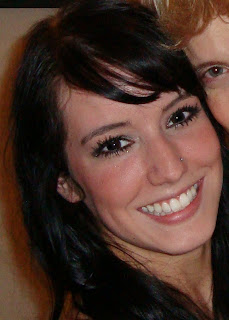
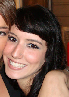
Here is the picture before and after using the red eye tool:


Now, if you aren't able to use the Red Eye tool, don't fret, we can still fix the problem, just with a little more work.

The way I choose to fix red eye manually is with the brush tool, because I feel like I have an easier time controlling my results. Zoom in really close to the eyes with the magnifying tool and then select the paintbrush tool. From there I select black as my color, however I make sure to turn down the opacity and flow options in the top toolbar to something maybe more like 40% each, so that we can gradually fill in the red with black to make it resemble how pupils should look. Make sure to preserve the glint in your pupil or else it will look extremely fake and this can be done simply by adjusting the size of your brush as necessary to maneuver around it and this is done by simply pressing the left and right brackets on your keyboard.

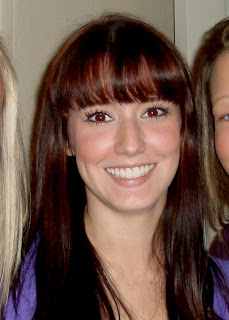
Here are the results I ended up with (pretty good right?!)


2. GREASE SPOTS

This is a problem I frequently deal with considering I have oily skin/I wear makeup. Into the night I notice that I become increasingly unsatisfied with pictures because of this problem. Pictures need not be held back only by this problem any longer.

In this picture, I have been sweating as you can tell, so it is a pretty good example to use. I find that in the right toolbar, the clone stamp tool (the one that looks like a rubber stamp) works the best and once again, we are wanting to make sure the opacity and flow are turned down in the top toolbar, this time to 30%. Using the alt key, define a source of a section of non-greasy skin to gradually cover up the grease spot, preferably something that is identical or as close as you can to the color of the original spot, we don't want to create a funky darker or lighter spot on your face. Don't be afraid to define multiple spots as you move around your face, you have shadows and highlights on your face, so piece of your face does NOT work for the whole thing! Also, don't forget about adjusting the size of the brush with the left and right bracket! Another thing- Try to avoid making your face completely matte, there are supposed to be natural highlights on your face, usually on your nose and cheeks, so on those spots, tone down, but don't completely remove.

Here are my results:


3. ZITS

After red eye, I feel like this is the second most common problem that keeps a picture from being great! Everyone has a break out every now and then, and most unfortunately for me, I either do a really good job covering them up with makeup or I have already edited them, so for this example I am using my friend's face, which is covered with fake freckles for a themed party. This is one of the few times you will experience through these examples the opportunity to completely cover it up and make it look like it was never there. However in the process you don't want to leave a weird colored mark, making people wonder what was/is on your face.

The tool we will mostly be using is the healing brush tool in the right toolbar. Select it and then using the alt key, define a source that the tool will use to cover up over the blemish. Make sure to pick a source that is close in color and shading to the spot you are trying to cover for the best results. Make sure to make use of the left and right brackets on your keyboard to adjust brush size so you can get the whole thing. Now you may choose to use the clone stamp tool after the healing brush tool to give it that extra blending subtlety that it may require, especially if you find yourself working on large areas of acne where it can begin to alter the look of your face. I have chosen to employ both just to finish it off. Just make sure to keep the clone stamp tool at a low opacity and flow, something like 30%, which can be adjusted in the top toolbar when you have the tool selected.

My Results:


4. PUFFY UNDEREYE/DARK CIRCLES

This problem is also another biggie for a lot of other people. Not too brag by any means but I have been lucky enough to not really have any dark circles (at least not just yet anyway) but I do sometimes experience undereye puffiness, which can be easily remedied with the clone stamp tool. This process goes the same for dark circles, however, more gradual work and be honest with yourself, if you have really dark undereye circles, don't pretend like they don't exist, just make them not as noticeable, or else you look weird and not like yourself.

Keeping the clone stamp tool set at an opacity and flow of 30%, define a clone source near your undereye, probably something slightly bit lighter. After you do, gradually and slowly move back and forth under your eye, sweeping the darkness or puffiness away. However, as previously mentioned about heavy dark circles, do not completely rid yourself of your under eyelid; it will make you look like an alien if you do. (a.k.a its not natural!)

Results:
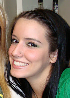


You may need to zoom in/ click on the pictures to see the difference, just because it IS subtle.


5. WRINKLES/DEEP LINES

Wrinkles and deep face lines will be dealt with in the same manner as undereye/dark circle problems. Subtlety is key, removing lines from your face completely is once again, unnatural (notice a pattern?), so softening is really what we are focusing on. I, once again, do not have a problem with wrinkles (man, I hope not at this age) but sometimes I smile really hard which produces funky lines on the side of my face sometimes in pictures. Just use the same steps as described in the undereye section until you are satisfied with the end result.

Mine:


Important things to remember! :

-stay natural, meaning don't overdo it on the retouching or it becomes super obvious
-gradual changes are the best. it may take longer, but it produces a more real effect
-the retouching is always worth it! have fun!

Project 2 Wrap Up

I think this project went a lot better than my previous project in a few different ways. For one, it was easier to focus on one project as opposed to trying to complete a few of them. Also, with this project I had a clearer idea of what I wanted to do from the get-go and I stuck with the project idea I had from the beginning and saw it through despite others changing their minds about screenprinting as their project. I feel like taking some time in the beginning to watch Illustrator tutorials on Lynda.com. I took the first week of project 2 to watch the "Beyond the Basics" tutorials about Illustrator, which I think was awesome because I had no idea about the different capabilities of Illustrator. For instance, I had no idea Illustrator, a 2-D program, could produce 3-D images. I had such a narrow view of Illustrator and now, I want to incorporate it as much as I can.


However there were also some struggles along the way. For one, like I just mentioned, other people in my group had agreed that they wanted to learn how to screenprint together, but then later changed their minds about their project, which I was not aware of. I had been waiting to do it with them/obtain our materials, that I learned later on that since no one was doing it anymore except me that no one had ordered any screenprinting supplies. No one's fault by any means, but the miscommunication lead to some draining of my worktime inadvertently.

Also, the vinyl led to some difficulties as well. Although it provides the benefit of allowing a super novice like me to learn how screenprint easier, while also giving the added bonus of allowing your screen to be re-usable if you peel off the vinyl, it can be fickle. I learned that vinyl definitely works better for a more simple stencil, that is also smaller and can be centered for more accuracy, because the more complex the shape, the more opportunity for the vinyl to get stuck to itself and create unsmooth bumps, which therefore lead to chances of the ink getting under the intended areas creating smudges. However, I don't regret using the vinyl, just because I was trying to learn how to do the whole process through an Instructable, but if I were to do this project again, I would probably seriously consider just going for the photoemulsion just to attempt to get a more clean product. Either that, or I learned from Keith if I put the vinyl on the back side and still put the ink through the front side, I would probably have a cleaner look, just backwards and with less issues of the bumps.

Overall though, I feel pretty proud of myself for figuring out the screenprinting pretty much without any experienced people's help. Considering that I am in the Comfort Zone/Something New, I definitely did something that was totally out of om comfort zone that is completely new to me. And that I feel like is an accomplishment in itself. That, and something came out of it that is completely usable and works. Furthermore, I think it was cool that the Illustrator tutorials proved to be very beneficial immediately, considering I needed to use one of the main tutorials on Live Trace to prep my file for vinyl cutting.

ARTD410 Project 2

So here is how my project went:

1. I needed to go out and find a chair to use to screenprint on, the two qualifications that were required: needs to be cheap and needs to be able to have fabric top and bottom that can easily be removed/replaced. I went to goodwill and instantly found what I was looking for. The chair was only five dollars and the cushions on the bottom and back could easily be removed with a screwdriver.


2. After I got the chair, I needed to get my supplies for the actual screenprinting, so I managed to pick up a yard of red canvas fabric from Walmart and the screenprinting materials from The Duck Store, which included the 8x10 screen, black screenprinting ink and the rubber squeegee.


3. Next, I needed to prepare my image for the vinyl cutter to be used as my "stencil" for screenprinting. I decided that the pattern on my unique sneakers would make for an interesting print on my chair. I took a few pictures of my shoe such as this:


I took the few pictures and them into photoshop and took pieces from them to make one custom pattern. I made selections of them so that the final product technically had no background. Then I took the file into Illustrator and used one of the things I learned from watching Illustrator tutorials on Lynda.com during the first week, called Live Trace. With this, I was able to create the outlines in anchor points necessary for the vinyl cutter while trying to make the objects I had within in smoother so the shape is simpler. I then took the file to the vinyl cutter, which I had a little more trouble with than usual, but managed to make everything come out okay. To be safe, I made two sets of the cut-outs, which later proved to be a very smart idea. :)

4. Next, I was advised by the woman at Walmart to wash my fabric before printing it, and because its a bright red color I figured that was a good idea especially if I plan on sitting on the chair without it bleeding onto my clothes.


5. Next, I prepped the screen. I unpeeled all of the spots that I wanted to the ink to go through like such:


Then I trimmed down around the piece of vinyl so that it was the right size for the screen.


However, much to my dismay, after adhering the vinyl to the screen and spending a half hour or so smoothing out any bumps with my squeegee, because the directions for vinyl screenprinting on Instructables are not the clearest, I soon realized that I had put the vinyl on the wrong side of the screen and had to remove and repeat the process over again. Unfortunately, I think that this definitely didn't help with the adhesion, because it was less sticky after completely removing it, therefore I feel like i had more bumps and more trouble trying to smooth out.


6. Then I took my cushions and placed them on the fabric and measured out the space I need to be able to wrap them around to the bottom, as well as the area I need to focus my screenprinting in.


7. Now I was ready to try to screenprint. I laid some paper underneath the canvas and placed the screen over it. I poured in some ink and because spreading it around with the squeegee. The Instructable said to go back and forth a few times so that's what I did.


However, after doing that I lifted the screen carefully and realized that not very much of the ink had gone through. So i tried to replace the screen in the same spot and go over it again. I pressed a lot harder the second time and kind of traced over where the screen was visible. This produced more visible results, however it may have been too hard because not only did the ink go through the shapes, but it also managed to push its way underneath some of the shapes creating huge smudges. I tried to do it again and the same thing happened.

8. So then I decided to clean the screen and remove the vinyl and put on the second piece.


I hoped that with putting the vinyl on the second time I could be more careful and precise about avoiding bumps, and therefore hopefully avoid smudges this time around. Funny enough however, I actually had even more trouble with the vinyl getting stuck on itself!

9. Either way, the second time around went a lot better. I tried to combine my techniques from the previous times, making sure to add pressure without pushing too hard and also lightly tracing with the tip of the squeegee over the exposed screen outlines. I wasn't able to avoid smudges, but I did manage to minimize them somewhat and allow more of the objects to be visible.


10. After letting them sit and dry for a couple hours, I took a blow dryer to them just to kind of make sure they were set in and then began attaching the canvas over the cushions. In order to really hold it down, I nailed in a nail a little ways to make a hole through the wood and then nailed a thumbtack into it. The nails were too long so that's what I opted for the shorter thumbtacks.


11. After the fabric was nailed back and fitted, I began screwing the cushions back onto the metal frame of the chair.


And then it was done! yay!